Sorted Group
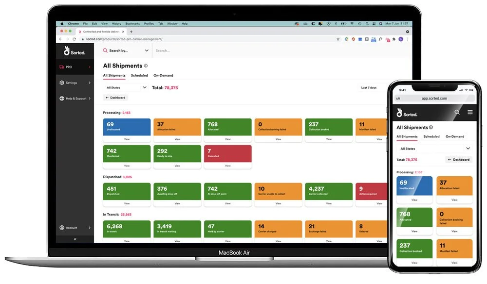
The Sorted platform gives retailers full control of delivery management – whether that's optimising checkout delivery options, enhancing carrier management in the warehouse, or offering market-leading post-purchase CX.
Problem
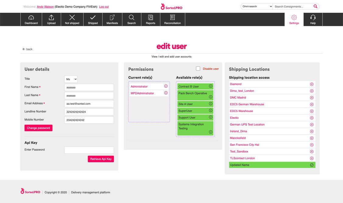
The existing PRO software worked on a legacy platform and evolved over time through various customer requests being bolted on. This resulted in a bit of a messy beast that was confusing and had no pattern or behaviour consistency. The learning curve was much bigger than it needed to be and was becoming a problem when selling the product to new customers.
Discovery
I started by familiarising myself with the existing product. I held a series of sessions with the Product Manager to get an understanding of the reasons why things were as they were.
It was clear that the existing screens had no real structure or hierarchy to them and were cluttered with everything displayed upfront. This made it very hard for users to know where to begin.
I mapped out a series of screen flows to visualise how everything knitted together. This allowed me to see where any dependencies existed across the product.
The next step was to read through (a lot of) pre-written requirements and flip them back into a problem statement. The reason for this was to challenge whether they were right. I then worked with the Product Manager and Principle BA to reframe them as opportunities so I could explore potential solutions.
Ideation
I began to sketch out some thoughts to shape how the new functionality could look and work. Because of the tight deadline involved, the front-end devs in my team needed to get to work asap. This meant that I had to work fast and efficiently.
As the UI was being influenced by existing guidelines, patterns and styles, I made the decision to produce wireframes that looked as close to the finished version as they could. This was important to get stakeholder buy-in as soon as possible.
I created prototypes to test the flows with the internal teams to ensure they were as intuitive as possible whilst delivering both user and business needs. I also made recordings of the prototypes that could be shared with members of the executive board to give them constant visibility of my progress and ideas.
Conclusion
Despite the extremely tight deadline, I managed to design all of the functionality, flows and screens that were needed. They were categorised in Zeplin using tags to make it easier for the devs to find and work from.
The project had been split up to deliver the functionality in Usable, Desirable and Complete chunks. At the time of leaving Sorted, an MVP had been released to the customer that included all of the Usable feature work, in addition to some of the Desirable and Complete work.
I created and handed over a complete design system to aid any future work and development. I’m proud to have left them in a much better place than when I started.


